Brand use
Featuring our logo or mascot
For anyone using our brand assets in advertisements, shoutouts, fan content or other external materials. Start with brand assets and the colour palette.
Brand and design
The authoritative reference for SpellWare brand and design standards, for anyone featuring our logo or mascot and for anyone building on our web platform.
Brand use
For anyone using our brand assets in advertisements, shoutouts, fan content or other external materials. Start with brand assets and the colour palette.
Developers
For anyone creating or contributing to web applications in the SpellWare ecosystem. Start with layout and the components.
All use of SpellWare brand assets must comply with our Code of Conduct. Each section below is labelled with the audience it applies to.
Brand use Developers
SpellWare has two primary brand assets: our logo and our mascot, Hikari. Both are available for use under the rules below.
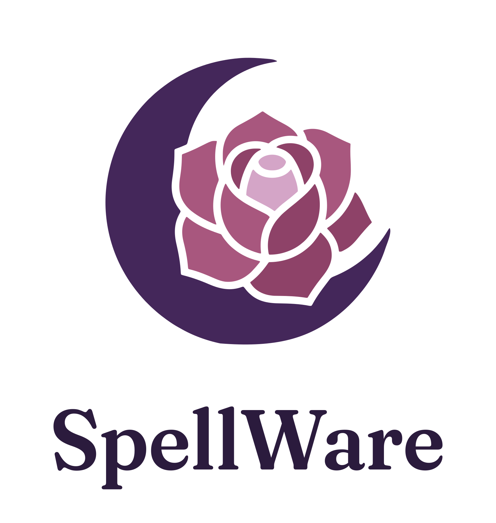
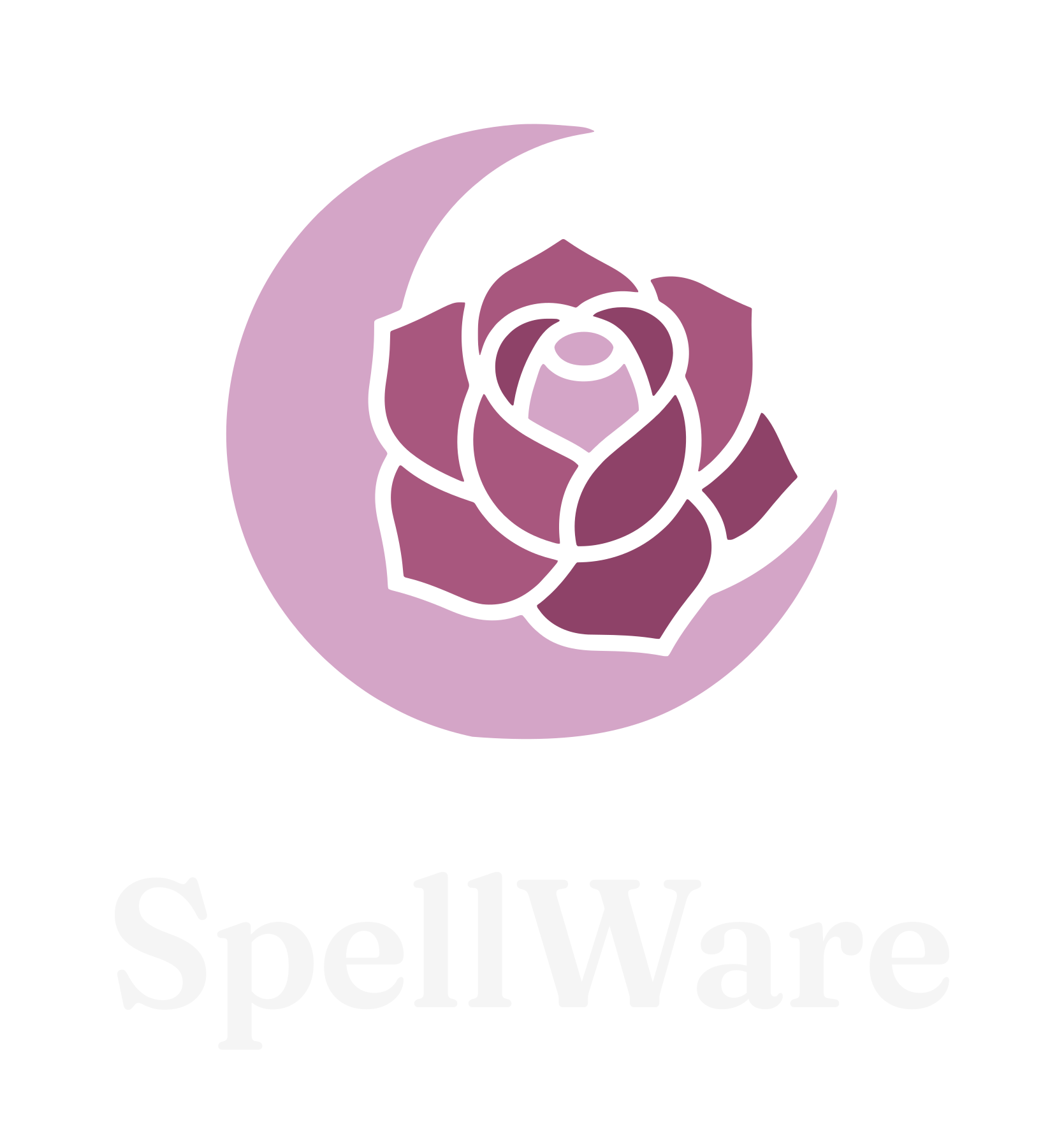
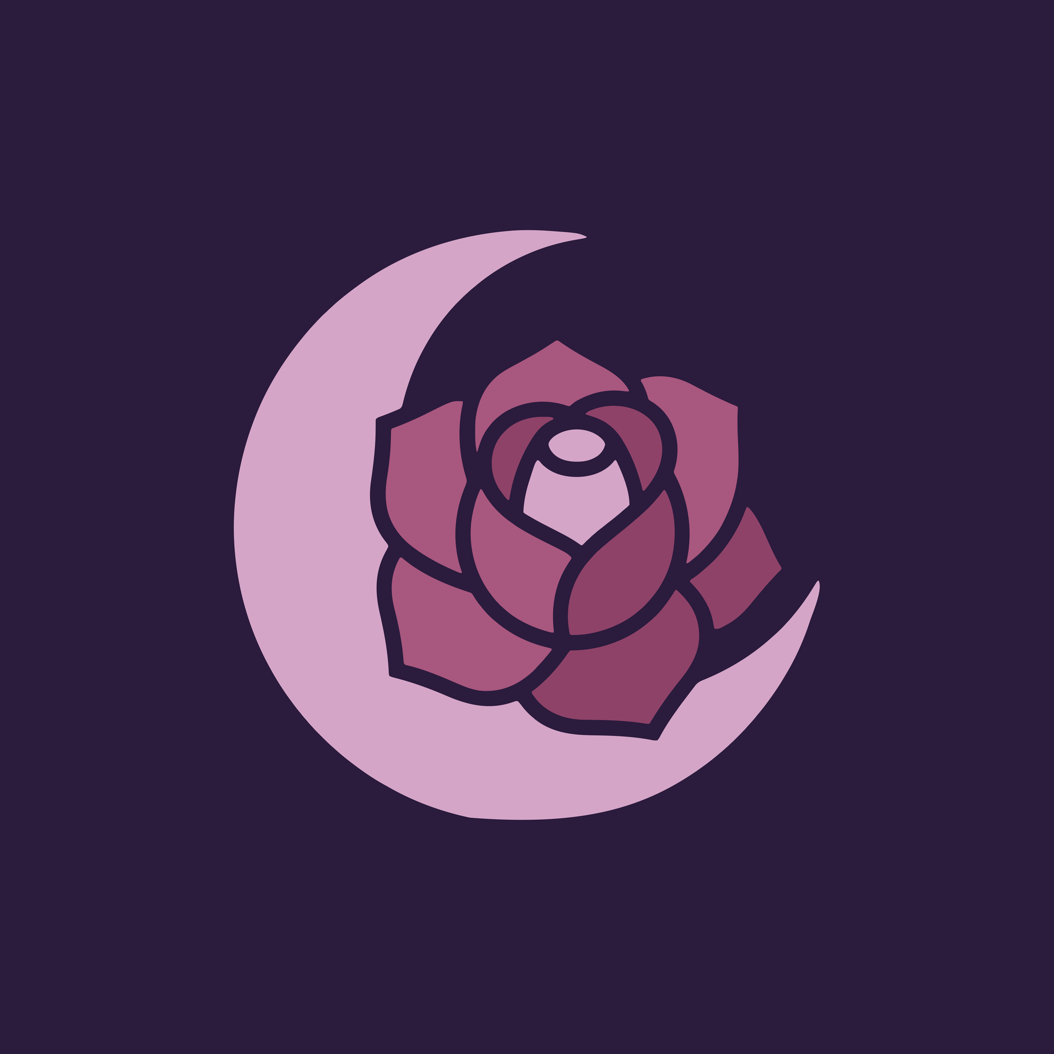
The logo has two approved colourways. Use the light files on light backgrounds and the reversed files on dark backgrounds. Each file is a vector SVG with a PNG alongside it. The crescent and rose symbol is also supplied on its own, as a light SVG and a reversed SVG.
Both assets must be used exactly as provided. No modifications of any kind are permitted. The following examples illustrate common prohibited alterations:
Do not recolour
Do not apply colour filters, tints, or overlays to either asset.
Do not rotate
Do not rotate either asset at any angle.
Do not stretch
Do not stretch, squash, or distort the proportions of either asset.
Do not crop
Do not crop, clip, or partially obscure either asset.
Do not invert
Do not invert, desaturate, or otherwise alter the colours of either asset. On a dark background, use the supplied reversed logo instead.
Hikari without logo
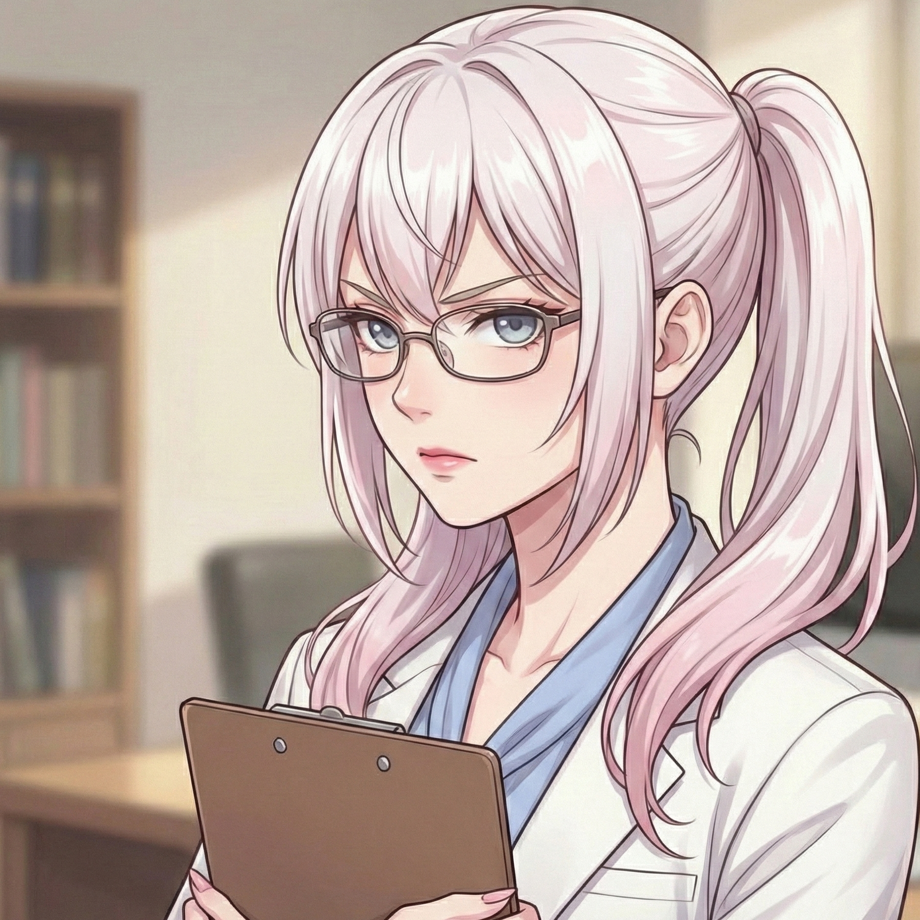
Do not use Hikari unless the SpellWare logo is also visible in the same area.
Our tagline is Thoughtfully built. Wonderfully human. It leads our brand line: it is the first line of the footer on every page, and the opening line of the homepage. It sits above our descriptor, Software engineering and community management for developer-facing companies, which stays in page titles and descriptions so that search results and link previews still say what we do.
On the homepage hero only, a supporting principle sits directly beneath the tagline: Exceptional work comes from people who are given the room, trust, and opportunity to do their best. It states how we work. It is not part of the tagline, and it does not appear in the footer, in structured data or on the social card.
Brand use Developers
These are the official SpellWare brand colours. Use them for any SpellWare-adjacent content to maintain visual consistency. Developers should reference the CSS custom property names rather than hard-coding hex values, so that a page stays in step with the rest of the site if a value changes.
Meet WCAG AA contrast (4.5:1 for normal text) for all text. The pairings below are the ones we use. Witch Rose is a fill colour, not a text colour on light backgrounds: it fails AA there, which is why Witch Rose Deep exists. White text on a Witch Rose button passes.
| Pairing | Contrast | Result | Use |
|---|---|---|---|
| Witch Purple on Witch Moon | 14.52:1 | AAA | Body text on pages |
| Witch Plum on Witch Moon | 11.44:1 | AAA | Links and secondary text |
| Witch Rose Deep on Witch Moon | 6.16:1 | AA | Accent text and eyebrows on light |
| White on Witch Rose | 4.85:1 | AA | Button label on a Rose button |
| Witch Mauve on Witch Purple | 7.54:1 | AAA | Accent text on dark surfaces |
| Witch Lavender on Witch Black | 14.86:1 | AAA | Body text on dark surfaces |
| Witch Rose on Witch Moon | 4.45:1 | Large text only | Decoration and large text only |
| Witch Rose on Witch Purple | 3.26:1 | Large text only | Decoration and large text only |
Use these in preference to the raw palette colours. The site is light only, so each has a single value. See dark mode for why.
| Variable | Value | Purpose |
|---|---|---|
--foreground | --witch-purple | Primary text |
--foreground-muted | --witch-plum | Secondary text, quotes |
--heading | --witch-purple | Headings |
--background | --witch-moon | Page colour |
--surface | #FFFFFF | Plain white surfaces, such as inputs and fallbacks |
--lit-surface | White in the upper right, shading to pink | Cards, the main container and dialogs |
--lit-border | rgba(168, 87, 126, 0.38) | Rose borders on lit surfaces |
--lit-shadow, --lit-shadow-hover | Rim light plus a rose glow thrown towards the light | The edge glow on lit surfaces, and its stronger hover form |
--accent | --witch-rose-deep | Highlights and marker colour |
--witch-rose-light | #F2B6D3 | Lighter Witch Rose, for glowing accents on dark surfaces only |
--link | --witch-plum | Link colour |
--link-hover | --witch-rose-deep | Link hover colour |
--border | --witch-plum | Strong borders |
--border-subtle | rgba(68, 39, 90, 0.16) | Dividers and outlines |
--highlight | --witch-mauve | Hover and highlight fills |
--nhc-header-height | 68px | Height of the shared header |
:root {
  --foreground: var(--witch-purple);   /* Primary text */
  --surface: #FFFFFF;                  /* Cards and containers */
  --accent: var(--witch-rose-deep);    /* Highlights and markers */
  --link: var(--witch-plum);           /* Links */
  --border-subtle: rgba(68, 39, 90, 0.16);
}Developers
Text is set in the system font stack, which is fast, accessible and familiar to readers. Fraunces, our wordmark typeface, is reserved for the SpellWare wordmark.
SpellWare
Use for the SpellWare wordmark and nothing else. It is the only web font we load. Set it at weight 600 with the optical size at 72 and softness at 50, so that the letterforms match the logo.
The quick brown fox jumps over the lazy dog
Applied automatically. Headings are bold (700) with slightly tightened letter-spacing.
const greeting = "Hello, world!";
Applied automatically to code and pre.
/* Only needed if you build a wordmark yourself */
@import url('https://fonts.googleapis.com/css2?family=Fraunces:opsz,wght,SOFT@72,600,50&display=swap');

:root {
  --font-brand: 'Fraunces', Georgia, 'Times New Roman', serif;
  --font-brand-variation: 'opsz' 72, 'SOFT' 50, 'WONK' 0;
  --font-body: system-ui, -apple-system, 'Segoe UI', Roboto, 'Helvetica Neue', Arial, sans-serif;
  --font-mono: ui-monospace, SFMono-Regular, Menlo, Consolas, 'Liberation Mono', monospace;
}Sizes used by pages on the shared layout, at a 16px root. Hero headings on the company homepage use larger display sizes.
| Element | Size | Weight | Line height |
|---|---|---|---|
h1 | 2.6rem, scaling down to 1.9rem on narrow screens | 700 | 1.2 |
h2 | 2.1rem, scaling down to 1.55rem on narrow screens | 700 | 1.2 |
h3 | 1.5rem | 700 | 1.2 |
h4 | 1.2rem | 700 | 1.2 |
| Body text | 1rem | 400 | 1.65 to 1.7 |
Developers
Pages that use the shared header script get Font Awesome automatically, so you do not add a separate import. Use standard i tags:
<!-- Solid icon -->
<i class="fas fa-heart"></i>
<!-- Brand icon -->
<i class="fab fa-github"></i>
<!-- Regular icon -->
<i class="far fa-star"></i>
Our own pages use small inline SVG icons instead, drawn on a 24-pixel grid with a 1.75 stroke, round caps and joins, no fill, and currentColor. Mark decorative icons with aria-hidden="true".
Developers
All SpellWare pages share a common foundation delivered by the shared header script. Include it in every page's head:
<script src="https://cdn.spellware.dev/headers/index.js" async defer></script>The script injects the design tokens, Font Awesome, the header, the footer, consent, analytics, HubSpot and the community popup. By default it also applies the shared layout, so your page only needs to provide a main element. It looks the same as the company site, because the company site is built from the same standards.
main: a centred, lit card, max-width: 1080px, padding: 40px, border-radius: 16px, with a rose edge, a rose glow thrown up and to the right, and a 16 pixel frost over the background.main is centred, except on HubSpot blog posts, which are left aligned because long articles read better that way. Headings scale down on narrow screens, so a long word never breaks across lines.| Max width | Changes |
|---|---|
| 860px | The header collapses to a Menu button, the footer drops to two columns, and main padding reduces to 24px and 20px. |
| 700px | The large surfaces drop their blur, because blur is costly on low-end devices. The background wash becomes 84% opaque and main uses a firmer white. |
| 480px | The footer drops to a single column. |
The header shows the full SpellWare wordmark. A page title appears beside it, after a divider. Set it with a data-nhcarrigan-title attribute on the html element. If you leave it out, the script takes the page's title without the SpellWare name or its separators. When nothing is left, or the title is just SpellWare, no title is shown and the wordmark stands alone. Long titles are cut short with an ellipsis, and on screens narrower than 480 pixels the title is hidden to make room for the menu button.
<html lang="en-GB" data-nhcarrigan-title="Tarot">Bespoke pages, such as the company site, can opt out of parts of the script by listing features in a space-separated data-nhcarrigan-exclude attribute on the html element:
<html lang="en-GB" data-nhcarrigan-exclude="layout footer cta ads">| Feature | Effect |
|---|---|
layout | Skips the shared page chrome, header and element styles. Design tokens still load. |
header | Skips the shared header. |
footer | Skips the shared footer. |
cta | Skips the community popup. |
ads | Skips the advertising script. |
Metadata, icons, consent, analytics and HubSpot always load. Anything your page already declares, such as meta tags and icons, is left alone. A page that already has its own header.site-header never gets a second header.
The company site builds the same look itself, with full-width sections inside a 1120px container and shared styles in assets/styles.css, so it opts out of the script's layout, header, footer and popup. Sections alternate between the page colour, white and a lavender tint, with dark hero and call-to-action bands. The header floats above the page as a translucent glass bar, and every page starts with a hero, so that nothing sits underneath it. Its class names are unprefixed (.btn, .card). The script's equivalents are prefixed nhc-, so they can never collide with an app's own styles.
Developers
These elements are styled automatically on pages that use the shared layout. No extra classes are needed. Buttons are rose pills with a soft glow, and tables, blockquotes and code blocks carry the same lit edge as cards. The previews below reproduce that styling.
<button type="button">Click me</button>
<input type="submit" value="Submit">
<button type="button" disabled>Disabled</button>An example link in body text, underlined so it is never colour alone.
<a href="https://spellware.dev">An example link</a>
<input type="text" placeholder="Text input">
<input type="email" placeholder="Email input">
<textarea rows="3"></textarea>
<select><option>Option one</option></select>| Name | Role | Status |
|---|---|---|
| Naomi | Founder | Active |
| Hikari | Mascot | Always here |
| Contributor | Developer | Welcome |
<table>
  <thead><tr><th>Column</th></tr></thead>
  <tbody><tr><td>Value</td></tr></tbody>
</table>Technology works better when the people using it are looked after.
<blockquote>Your quote here.</blockquote>Use inline code within body text.
const greeting = "Hello, world!";
console.log(greeting);
<code>inline code</code>
<pre><code>// your code here</code></pre><ul>
<li>First item</li>
<li>Second item</li>
</ul>Developers
Beyond the automatic element styling, there is a set of named components. The company site defines them in assets/styles.css. Pages that load the shared header script get the same components, with an nhc- prefix. The previews below use the company site classes.
| Component | Company site class | Shared script class |
|---|---|---|
| Buttons | .btn, .btn-primary, .btn-ghost, .btn-dark, .btn-outline, .btn-small | .nhc-btn, .nhc-btn-primary, .nhc-btn-ghost, .nhc-btn-dark, .nhc-btn-outline, .nhc-btn-small |
| Section heading | .section-head, .eyebrow | .nhc-section-head, .nhc-eyebrow |
| Card, quote and notice | .card, .quote, .notice | .nhc-card, .nhc-quote, .nhc-notice |
| Grids | .grid-2, .grid-3 | .nhc-grid-2, .nhc-grid-3 |
| Availability pill | .availability | .nhc-pill |
| Accent phrase | .accent | .nhc-accent |
| Featured card | .feature-card | .nhc-feature |
| FAQ question cards | .faq-grid, .faq-card | .nhc-faq-grid, .nhc-faq-card |
| Topic chip | .faq-topic | .nhc-chip |
<!-- On the company site. In an app that loads the shared script, use nhc-btn nhc-btn-primary and so on. -->
<a class="btn btn-primary" href="/">Primary</a>   <!-- on dark bands -->
<a class="btn btn-ghost" href="/">Ghost</a>       <!-- on dark bands -->
<a class="btn btn-dark" href="/">Dark</a>         <!-- on light backgrounds -->
<a class="btn btn-outline" href="/">Outline</a> <!-- on light backgrounds -->Eyebrow
Supporting copy that introduces the section.
<div class="section-head">
  <p class="eyebrow">Eyebrow</p>
  <h2>A section heading.</h2>
  <p>Supporting copy that introduces the section.</p>
</div>Cards group related content on a frosted surface.
<article class="card"><h3>Card title</h3><p>Content.</p></article>
<aside class="notice"><h2>Notice</h2><p>Content.</p></aside>Frosted glass and a soft rose glow are the SpellWare look on every page. The company site builds them itself, and the shared header script applies the same treatment to every app that loads it.
| Surface | Treatment | Rule |
|---|---|---|
| Page background | The artwork, frosted over by a rose and lavender gradient wash about 40% opaque, with a 14 pixel blur | The artwork must still show softly through. On phones the blur is dropped and the wash is 84% opaque |
| Main content card | A lit white surface with a rose edge, a rose glow thrown up and to the right, and a 16 pixel frost | All page text sits on this card, so check contrast over the artwork behind it |
| Community popup | A lit dialog with a rose glow, a glowing logo and a glowing primary button, over a rose-tinted frosted backdrop | Shown at most once a week. The close button keeps its focus ring |
| Header | Dark glass at 72% opacity with an 18 pixel blur, floating 12 pixels from the top, with the same links and logo on every page | Keep it at 72% or more, so that the navigation links keep AA contrast over anything scrolling beneath |
| Cards and notices | White glass at 58% opacity with a 16 pixel blur | Text on them must still meet AA over the strongest colour wash behind them. On phones they use 82% white with no blur |
| Process steps | White glass at 6% opacity over a dark section with a colour wash | Use it on dark sections only |
| Primary and ghost buttons, key figures on dark bands | A soft rose or mauve halo, with a lit top edge on the primary button | Static, in brand colours, and never on body text |
| Light sections | A Witch Rose and mauve wash from the upper right, a mauve bounce light at the lower left, a pale shaft of light across the section, and light spilling over from any dark band above | The cores of the washes sit away from the text. Cards are lit white on the side facing the light and shade to pink on the other |
| Edge glows on cards, steps and section seams | A rose rim inside each card, a rose glow thrown towards the light (up and to the right), and a glowing rose line along the top of each section | Built from shadows, so it needs no extra elements. Stronger on hover. Quotes and notices keep their rose left edge |
| Availability pill | A rose glass pill above the hero headline, with a glowing rose dot, stating that we are taking on new engagements | On the company site the dot pulses gently, and stays still for readers who ask for reduced motion. It is the only animated glow on the site. In the shared script the dot is static. Keep the wording true: change or remove the pill when it stops being so |
| Accent phrase | A lighter Witch Rose tint with a rose glow, set on the .accent class, used for the key phrase of the homepage headline | Large type on dark backgrounds only. It is too light to read on a light background. Use it for one phrase, not whole headings |
| Featured testimonial card | A dark, rose-lit card on a light section, with a large glowing opening line, a rose edge glow and a glowing quote mark | Use it once per page, for the single testimonial that matters most. Light text on dark, so check contrast over the brightest part of the light |
| FAQ cards | Lit white question cards with a glowing rose question mark and a rose edge glow that strengthens on hover | Each card is a link to the full answer on the FAQ page. They show only the question, never the answer |
| Footer | A rose key light, faint rays and a glowing top edge. Each link has a rose dash that lengthens on hover, with a rose underline that draws in, and external links carry an arrow | Link text stays at AA contrast on the strongest part of the light, and the keyboard focus ring is kept |
| Hero, process section, community band and footer | One Witch Rose key light from the upper right, fading into plum and black, with faint diagonal rays on the hero | Keep the bright part away from the text, so the left stays in shadow. On narrow screens the light is smaller and in the corner |
backdrop-filter or the reader asks for reduced transparency.Developers
Version 6 of the shared header script removed the dark theme, the footer's theme toggle and the is-dark class. SpellWare is light only, lit from the upper right, so every page looks the same for every reader and stays consistent with the company site.
is-dark any more, and any .is-dark overrides in your own styles will simply never apply..your-custom-element {
background: var(--lit-surface);
color: var(--foreground);
border: 1px solid var(--lit-border);
box-shadow: var(--lit-shadow);
}Developers
The shared stylesheet styles the scrollbar and text selection. These apply automatically, so do not override them in page stylesheets.
scrollbar-color.::selection { background: var(--witch-rose); color: #FFFFFF; }Developers
Motion is subtle and never decorative on its own. Interface changes should feel responsive, not playful.
prefers-reduced-motion: the shared stylesheet turns transitions off for readers who ask for less motion, and your own animations should do the same.Developers
Three decorative classes from the previous look still exist so that older pages keep working. They now simply use the Fraunces wordmark face, with no shadows, skew or gradient. Do not use them in new work.
| Class | Now | Instead |
|---|---|---|
.witchy-accent | Fraunces, semibold (600) | Normal text, or strong |
.mystical-text | Fraunces, semibold (600) | A heading element |
.spooky-title | Fraunces, semibold (600) | A heading element |
Developers
Version 5 of the shared header script replaced the earlier, more whimsical look. If you built on the old guide, these are the changes:
| Previously | Now |
|---|---|
| Kalam body text and Griffy headings, plus Creepster and Henny Penny | System fonts everywhere. The wordmark face only is a web font: Griffy until version 6.1, and Fraunces since. |
| Four custom SVG cursors | The browser's standard cursors. Remove any custom cursor styles. |
Wiggling, rotated h1 and rotating buttons | Static headings and buttons that lift by 1 pixel on hover. |
| Purple gradient overlay and glowing container shadows | A translucent wash in the page colour over the background artwork, and a soft neutral shadow. |
| Fixed 75-pixel footer | A footer at the end of the page, so it never covers content. |
| 14pt root font size and star list markers | A 16px root and standard markers in the accent colour. |
--accent was Witch Rose | --accent is Witch Rose Deep, which passes contrast on light backgrounds. |
Version 6 of the shared header script brings every app in line with the company site. The "glowing container shadows" in the table above are back, in a restrained form: a soft rose glow and a lit edge, described under glass and glow.
| Version 5 | Version 6 |
|---|---|
| No header. Pages supplied their own. | A floating glass header with the company site's logo and links. The text beside the logo is the page title. |
| A small footer with legal links, the address and a theme toggle | A replica of the company site footer. There is no theme toggle. |
Dark mode through the is-dark class | Light only. See dark mode. |
A neutral wash over the artwork, controlled by --page-overlay | A rose and lavender gradient wash, frosted over the artwork. The --page-overlay variable is removed. |
main as a plain white card with a neutral shadow | main as a lit, frosted card with a rose edge glow |
| Flat buttons and a plain popup | Rose pills with a glow, and a lit popup with a glowing button |
| No named components | Opt-in nhc- components for cards, notices, pills, FAQ cards and more. See opt-in components. |
Have a question this guide does not cover? We are happy to help.